Teacher Demonstration
Use the live model as a shared screen demonstration before students try their own predictions and observations.
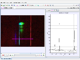
Use Hydrogen Emission Spectrum Tracker as a Tracker line-profile activity for hydrogen spectroscopy: calibrate the spectrum image, read luma peaks against wavelength, and match bright emission lines to the visible Balmer series.
Use the live model as a shared screen demonstration before students try their own predictions and observations.
Open the simulation, adjust the controls, and compare what changes on screen before answering the concept-check questions.
Which bright peaks in the line profile match the expected hydrogen emission wavelengths, and how reliable is the wavelength calibration?
Use Tracker Online to view the hydrogen image and the selected profile A line across the spectrum.
Inspect the calibration points on the X axis so pixel position is interpreted as wavelength rather than distance travelled.
Use the luma graph to locate narrow intensity peaks. These peaks correspond to bright hydrogen emission lines.
Compare the measured peak wavelengths with expected Balmer lines, then discuss uncertainty from exposure, line width, alignment, and calibration.
Use this as a spectroscopy data-analysis activity. Students should treat Tracker as a line-profile measuring tool for an image, not as a motion tracker.
Ask: What does the x-axis represent after calibration? Which luma peaks are strongest? Which lines look saturated or broad? How close are the measured peaks to expected Balmer wavelengths?
Have students mark the red, blue-green, and violet peaks on the graph before naming H-alpha, H-beta, or other Balmer lines. This keeps the conclusion tied to measured evidence.
These questions are generated from the topic and the concept illustrated by the simulation. Use them after students have explored the model.
Correct first attempts build a streak and unlock higher point multipliers on this device.
1. What is being analysed in this Tracker package?
2. What does the line profile mainly measure?
3. Why are calibration points important here?
4. What do narrow bright peaks in the luma graph represent?
5. What should a good conclusion compare?
Unlocks after 3 correct concept-check answers on this page.
1. What source evidence shows that this Tracker activity is about spectroscopy?
2. What does a strong peak on the luma graph mean?
3. Which evidence best supports identifying the red hydrogen line?
4. What measurement caution should students include?
5. What final explanation is most appropriate?
Anonymous activity shows this resource is being discovered, revisited, and used by learners in different places.
Country or region is inferred anonymously from server location headers when available. No names, accounts, or IP addresses are shown.